
Web collection and app concept that highlights bottle cap designs and allows users to capture, upload and share unique bottle caps.
CAP’D is my attempt at answering the question: How can design present a large collection of information in a visually stunning and user friendly way? This was given to us as a UX/UI project. I began by choosing the subject matter of what my collection would be about.
I needed something easily accessible but I wanted the subject matter to relate back to design. That night I raided my closet and found a zip-lock bag with 18 bottle caps I’ve kept over the years because I liked the illustrations on them.
Bottle caps are disposable knickknacks whose unique, often vernacular designs are consistently overlooked. They were the perfect subject matter for the web collection. I wanted a name that captures the casual and amusing nature associated with drinking (and design) so naturally I went with a pun. CAP’D is a play on the words ‘cap’ and the abbreviation of ‘captured’.
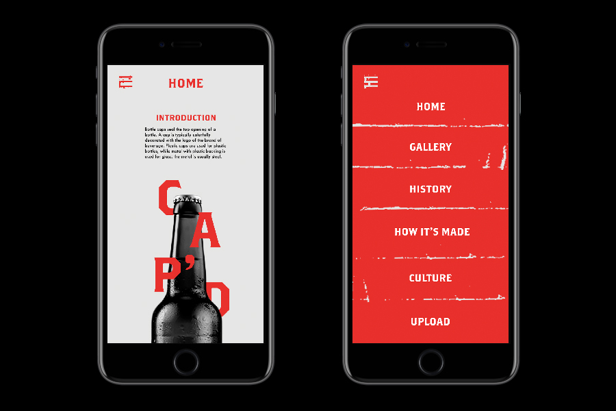
The design phase began with formulating content beyond the collection and wire-framing the website. I used my sketchbook to wire frame, then after selecting typefaces and creating the visuals and assets, began the digital prototype using Adobe XD. View the web prototype here and the app prototype here or by clicking on the images.
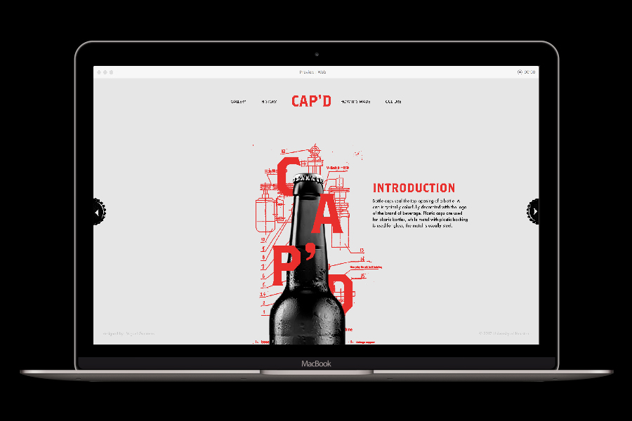
Brothers and Futura are used as the main typefaces for CAP’D. Brothers mimics the toothiness of the bottle caps, primarily typeset in the bright red, it ties itself back to the illustrative bottle cap machine schematics. Futura provides readability to the content, elevating the website to a more contemporary place.
The visual identity is inspired by collages and old schematics of bottle cap machines. The contrast produced by collaging old illustrated schematics and high-contrast photographs of machines and bottles give the website a modern feeling while referencing the disposability and grittiness of these objects.
The color palette is a stark black and light gray with red accent colors. The use of a singular color and high contrast black and white photographs allow the designs of the bottle caps in the collection to pop (killing it with these puns). The bottle caps grab user attention in a more direct way, and the stark background highlights the form of the crowned caps.
CAP’D highlights bottle cap designs and allows users to capture, upload and share unique bottle cap designs. While the collection is the highlight of the website, it is developed beyond being just a digital display. Users can also read about the history of bottle caps, caps in pop culture, and view a ‘how-its-made’ video on the web and app.
CAP’D currently has thirty unique bottle caps in its collection. Viewers can get an in-depth look at the current collection on a web or mobile device as well as add to the current collection by uploading photos of bottle caps they take. Allowing the expansion of the collection through user contribution makes the collection interactive and engaging.
Back to project page
DISCIPLINE
UI/UX
Web design
App design
Web design
App design
SECTOR
Education
Arts & Culture
Technology
Arts & Culture
Technology
DESIGNER
Miguel Guerrero
PROFESSOR
Yoon Kim